Lead Designer | 2023 | Badoo (Bumble inc)
Highlights
3 Months | 2023
A series of A/B tests across the whole of chat experience
Women's experience team
Charged with improving retention and chats initiated
Skills
Iterative design for A/B tests
Workshop Facilitation
Stakeholder Management
Research
Badoo is a ten year old dating app which is part of Bumble Inc.
With 460 Million active users it is the third largest dating app in the world.
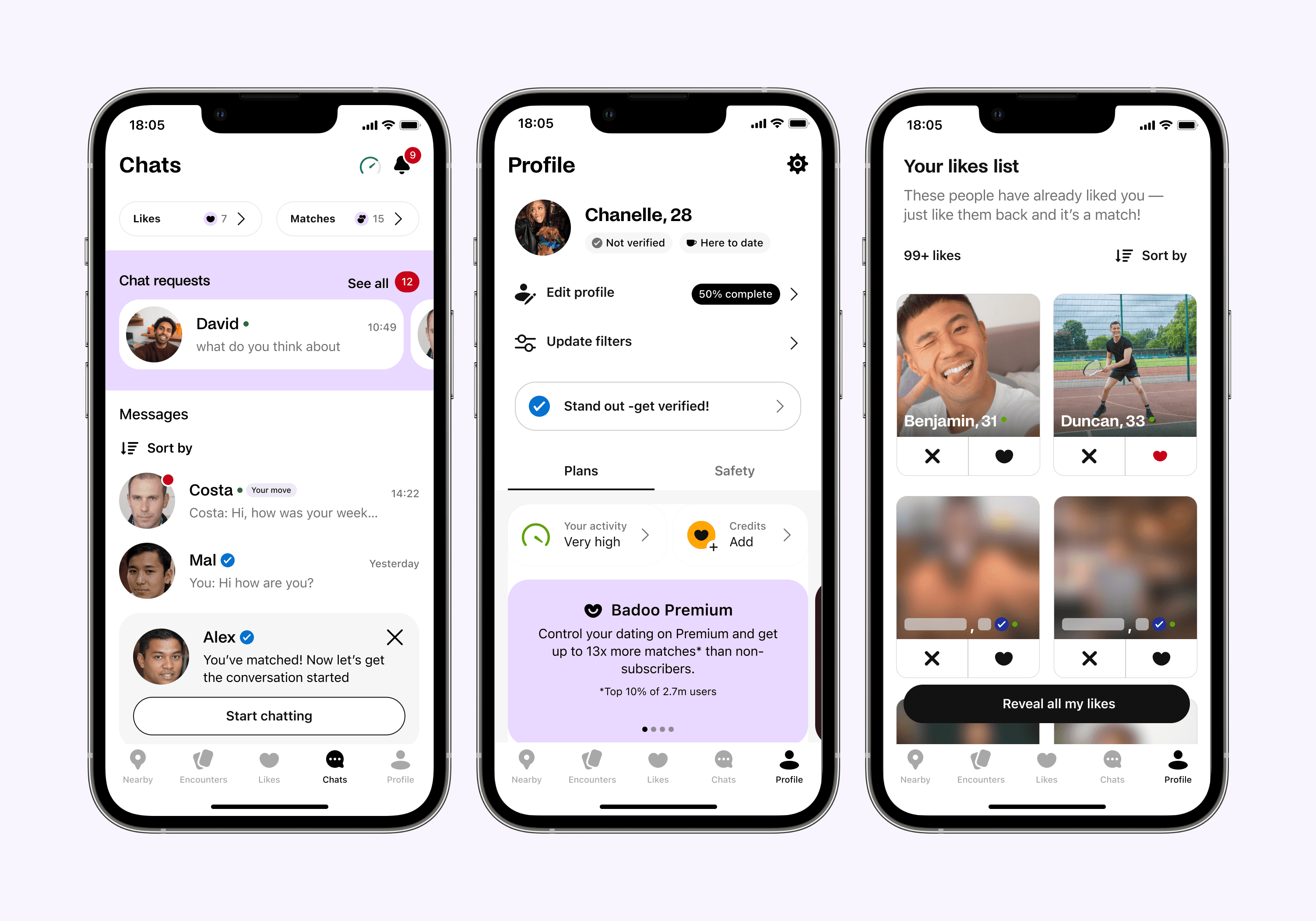
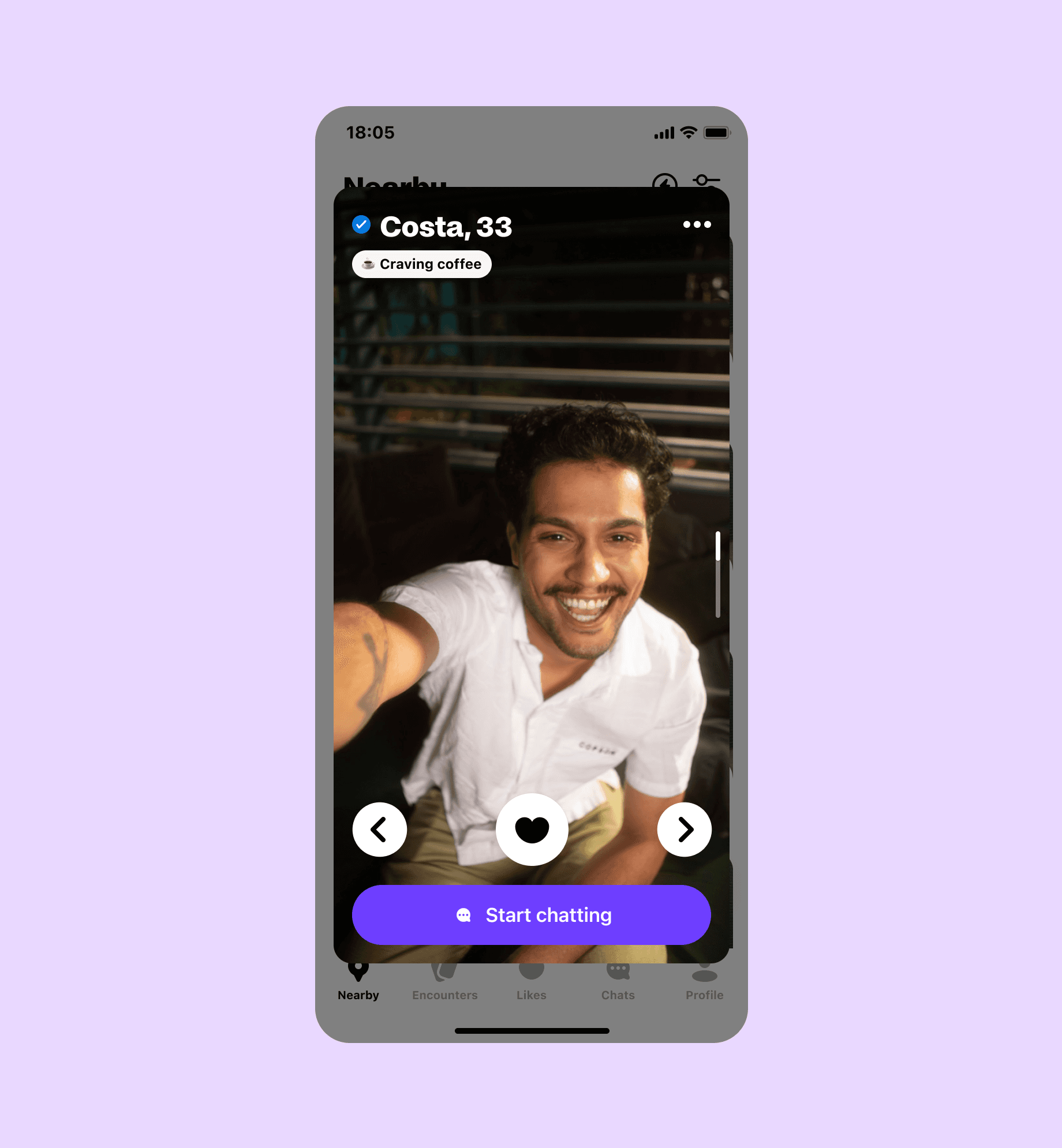
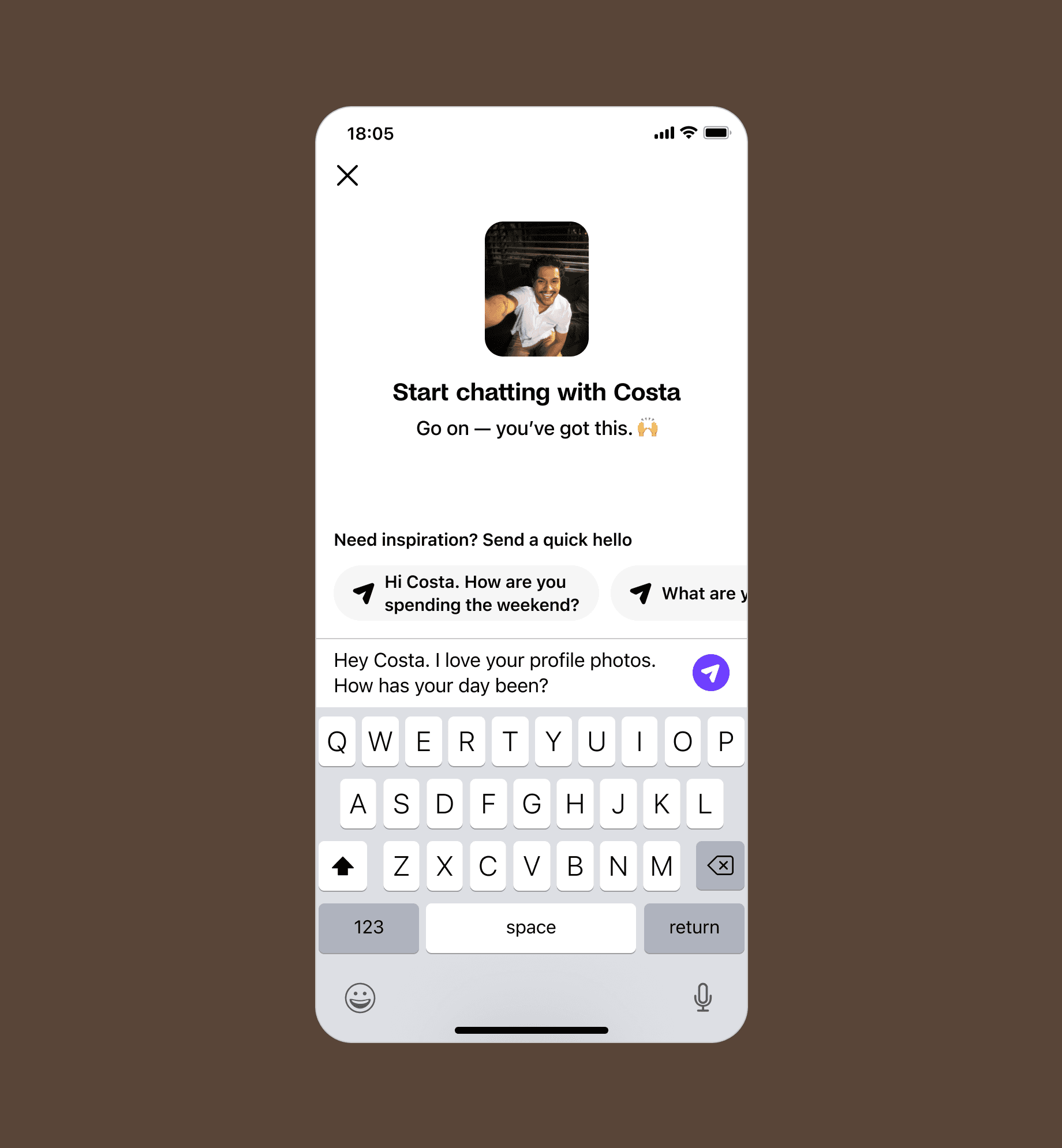
The new Quick Hello feature was designed to further increase chats and use AI to improve the quality of those chats.
Badoo's ecosystem consists of 35% women and 65% men. To keep the ecosystem heathy, you have to keep women happy, Quick Hello was doing the opposite.
Positive metrics
2% increase in chats initiated Per person
3% per person users receiving a first reply
Stable metrics
No negative revenue impact
No impact on retention
Negative metrics
Total Number of chats down
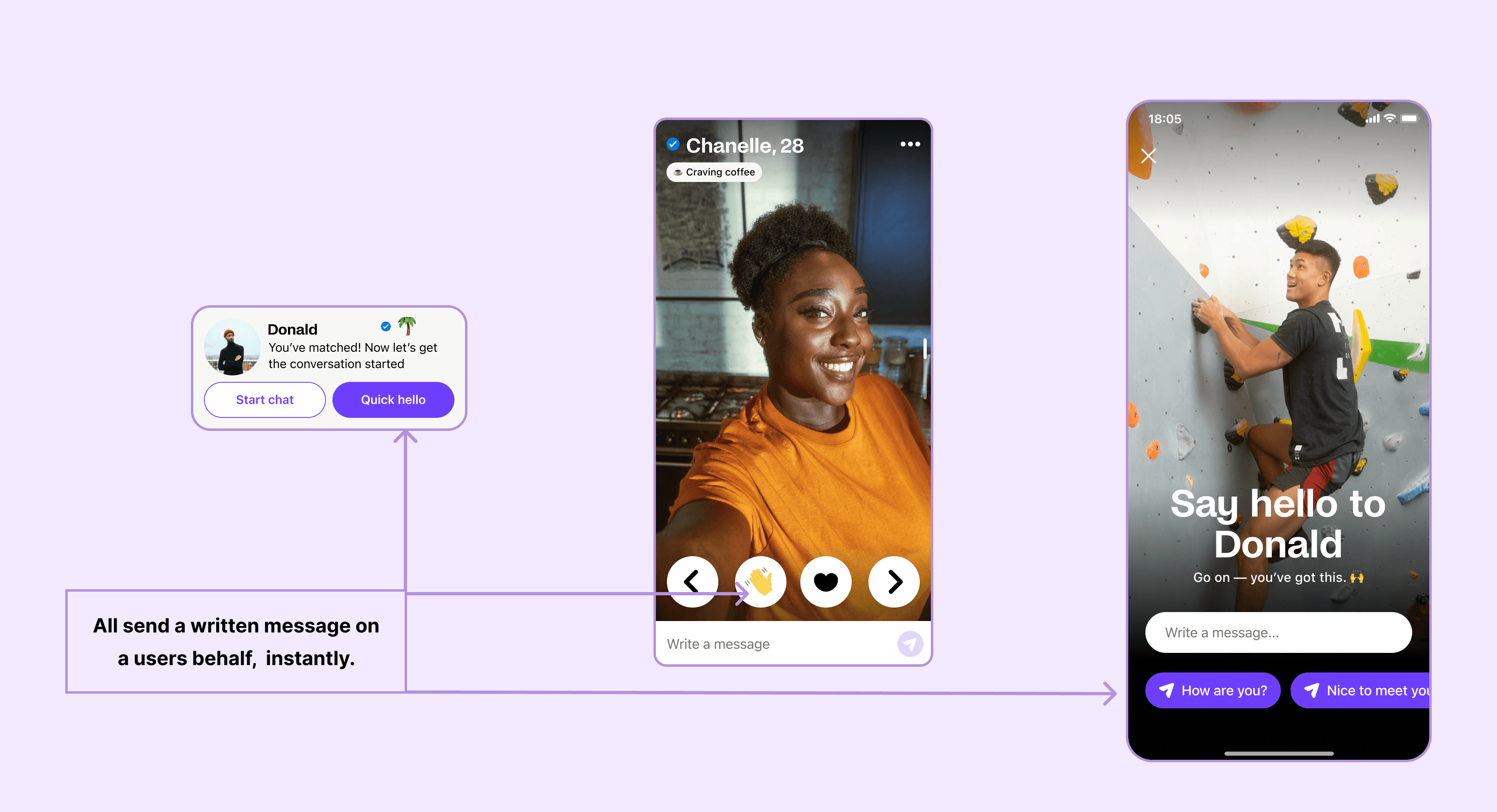
During the diary studies users became confused where chats had come from in their inbox. We then realised that a relatively new feature called ‘Quick Hello’ which sends messages on a users behalf was creating the problem.
To further the problem , the UI of a Quick Hello has three different visual styles,the most confusing example is a simple emoji on the app which gives no affordance to what it does.
Below are examples of the same feature expressed in different UI throughout the app.
The business shipped Quick Hello's globally without fully understanding it's implications. According to the business Quick Hello's was delivering amazing results:
Positive metrics
Number of chats initiated
Positive metrics
Number of chats replied
Positive metrics
*Number of quality chats
*good chats are the number of back-and-forth messages and a few other factors.
My action plan
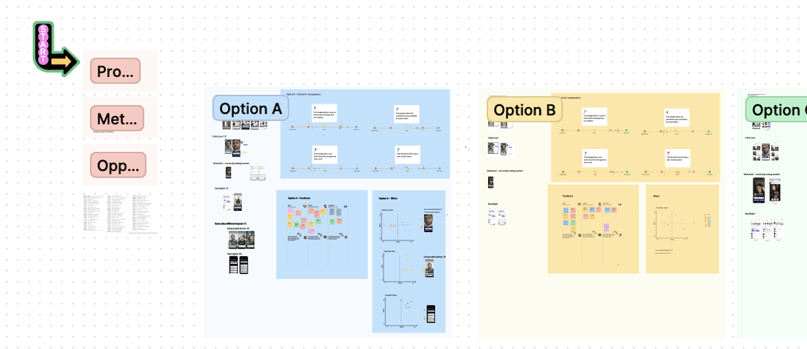
My strategy was to present the findings to the business and create a collaborative women's experience working group. This would span across four pods that owned the main sections of the app
Ran a multi discipline workshop to create alignment and clear scope
Create iterative designs for multi A/B tests to minimise negative impact
Test new AI quick openers with key stakeholders and discuss pro's and con's
I facilitated a workshop with the Chat pod who had originally designed Quick Hello and our own pod. I presented the evidence from the research, a clear objective for the workshop and four different design solutions. We weighed up all solutions in terms of effort V impact and decided on a direction forward.
Design Goal
Make Quick Hello’s feature transparent to users and ensure the same visual style and flow in every instance, reducing cognitive load and potential error.
Design Challenge
To unify all the different UI used for Quick Hello's throughout the app

Outcome
Clear affordance for Quick hello's
Aligned UI across all touch points
New steering of users to write their own messages as Quick Hello’s were not very advanced
Test BETA AI openers which made the written part of Quick Hello's, some of which were problematic.
Unsurprisingly, people were starting less chats. The number of chats went down by 15% and the number of replies went down by 10%.
Why?
Hypothesis 1 - we increased usability so now a user understood their actions and could back out.
Hypothesis 2 - the design before was the lowest effort for people who knew what the feature was and wanted to send a high quantity of low effort messages (predominantly this user group is paying men).
Iterate
We had only had a week to iterate from design to dev before the Women’s Experience team moved on and another team in charge of chat picked this up.
Our design iterations included:
A new header area which looks familiar to the chat screen to create familiarity as to what to do.
Adding interests and intentions as a helper for creating a message.
Adding different colour options (with a forming design system our tests will inform the design system about colour rules).
Adding a labelled CTA to send messages to help understanding and accessibility.
Reducing and adding actionable content to the modal to funnel the user towards to sending a message.
Lessons Learned
Strong stance divides and silences, loose gives the conversation no structure. But strong opinions loosely held encourage conversation and progress.
As tricky as it can be to fight for the user over business metics there will always be a balanced solution. Its worth the endless discussions and proof points. Our test revealed no negative revenue results but not an easy project to get made!
More case studies